Is Civilization VII's UI as Bad as Advertised? A Critical Analysis

Civilization VII's Deluxe Edition launched recently, and online discussions are rife with criticisms of its user interface (UI) and other aspects. But is the UI truly as flawed as many claim? This analysis dissects the game's UI, comparing it to established principles of effective 4X game design.
← Return to Sid Meier's Civilization VII main article
Assessing Civ 7's UI

Early reactions to Civ VII, especially concerning its UI, have been mixed. While it's easy to join the chorus of criticism, a more objective evaluation is needed. We'll examine the UI's components against the benchmarks of a well-designed 4X interface.
Defining a Superior 4X UI
While some argue for objective standards in 4X UI design, the reality is more complex. A UI's effectiveness depends on the game's style, goals, and context. However, common elements contribute to successful UIs across various 4X titles. Let's evaluate Civ VII against these key elements.
1. Clear Information Hierarchy: A good UI prioritizes important gameplay information. Frequently used elements should be prominent, while less critical features remain easily accessible.
Against the Storm provides a strong example. Building menus are tabbed, prioritizing common actions (worker assignment, production) while placing less frequent functions in separate tabs.
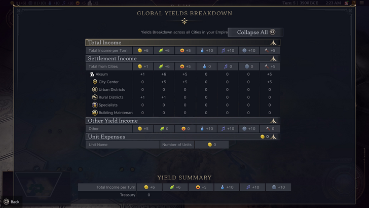
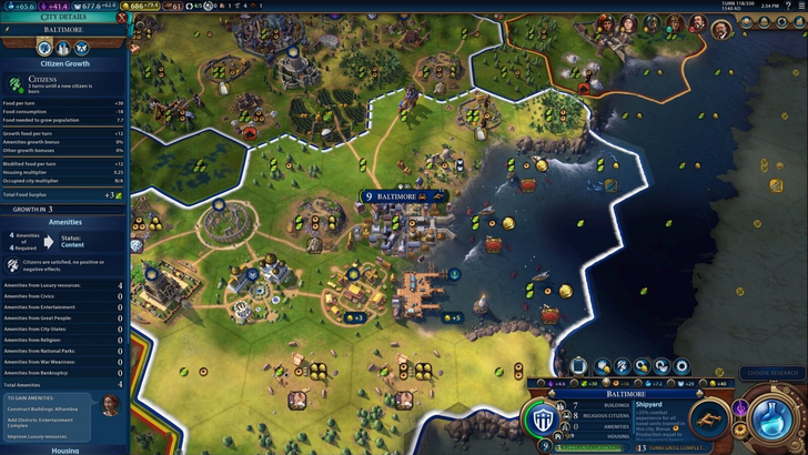
Civ VII's resource summary works adequately, separating income, yields, and expenses. However, it lacks granular detail; it shows resource totals from rural districts but not the specific districts or hexes. This limits its effectiveness.
2. Effective Visual Indicators: Icons and graphics should convey information quickly, minimizing reliance on text.
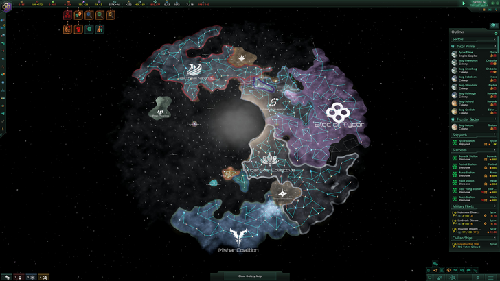
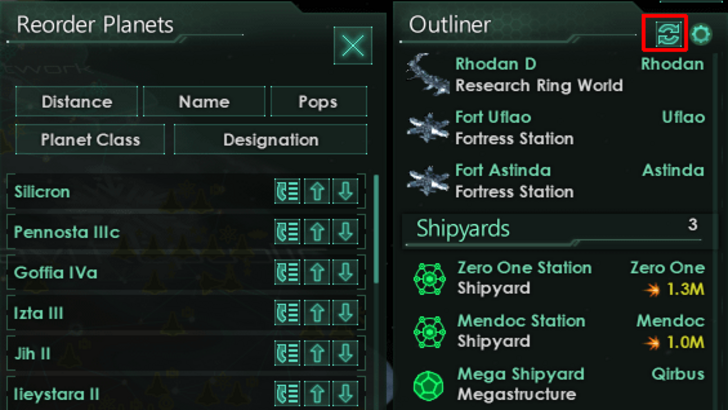
Stellaris, despite its cluttered UI, uses effective visual indicators in its Outliner. Icons instantly communicate the status of ships and colony needs.
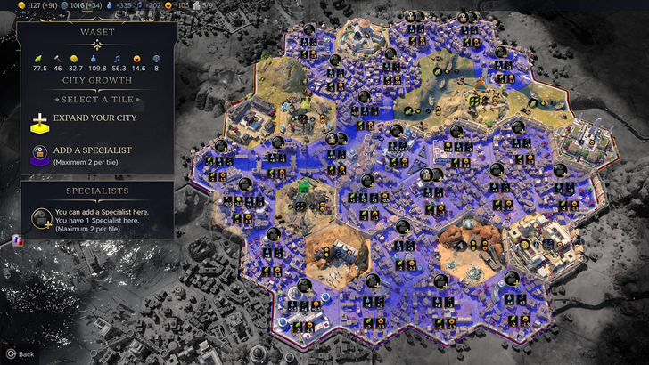
Civ VII utilizes tile yield overlays, settlement overlays, and settlement expansion screens effectively. However, the absence of certain lenses (like those for appeal or tourism in Civ VI) is a significant drawback for many. The lack of customizable map pins is also criticized.
3. Search, Filtering, and Sorting: These features are crucial for managing large amounts of information.
Civ VI's powerful search function allows players to easily locate resources, units, and features on the map. Its Civilopedia links seamlessly to in-game elements.
Civ VII's lack of a comprehensive search function is a major point of contention. This absence significantly impacts usability, especially given the game's scale.
4. Design and Visual Consistency: The UI's aesthetic should be cohesive and appealing.
Civ VI's cartographical style integrates seamlessly with the game's visuals.
Civ VII adopts a minimalist, sleek design. While not unattractive, its subtle thematic direction might not resonate with all players. This lack of immediate visual clarity contributes to mixed reactions.
The Verdict

While Civ VII's UI isn't perfect, the criticisms are arguably overblown. Missing features, such as a search function, are significant but not game-breaking. Compared to other issues, the UI's flaws seem relatively minor. While it falls short of some competitors' visually striking and efficient UIs, it has strengths. With updates and player feedback, it has the potential to improve significantly.
← Return to Sid Meier's Civilization VII main article
Civilization VII Similar Games

 Latest Downloads
 Downlaod


 Top News